
Bridging the gap for the users to know symptoms and causes more
DATE
Fall 2026
ROLE
UX/UI Designer
TOOLS
Figma | Figmake | FigJam
CATEGORY
App Design | UX/UI Design
CONTEXT
Unnoticed Label and symptoms that confuses you to cure
Most aged users have difficult to find the label on the medicine hard to read and recognize. The users have hard time figuring out the symptoms they are having which feels not serious to cure with out physicians.
THE PROBLEM
How might we make users get there symptoms checked in the best possible way and making it less stressful and simple?
With too much source of information, users struggle to find the right and proper decisions on their symptoms, turning a basic medicine cure into an overwhelming task.
Key Insights
A lack of symptoms checker for the users
While researching our competitors like ZocDoc, MyChart and Apple Health, they are more focused on either appointment with doctors or recording the health, while lacking simple symptoms checker and recommending cure.
More than 60% of users don’t understand their own health data, 50% of chronic patients skips medications. (Based on WHO, 2026 and JAMA, 2024)
SOLUTION
Symptom checker CTA button
The main CTA button is made with Symptom checker in the Home screen where users should feel confused and easy to do the task. Changes : The app should give more way to interact and keep users in the home screen which was lacking in the version 1 which is solved after usability testing in the version 2 with more graphical info and styled CTA Button.

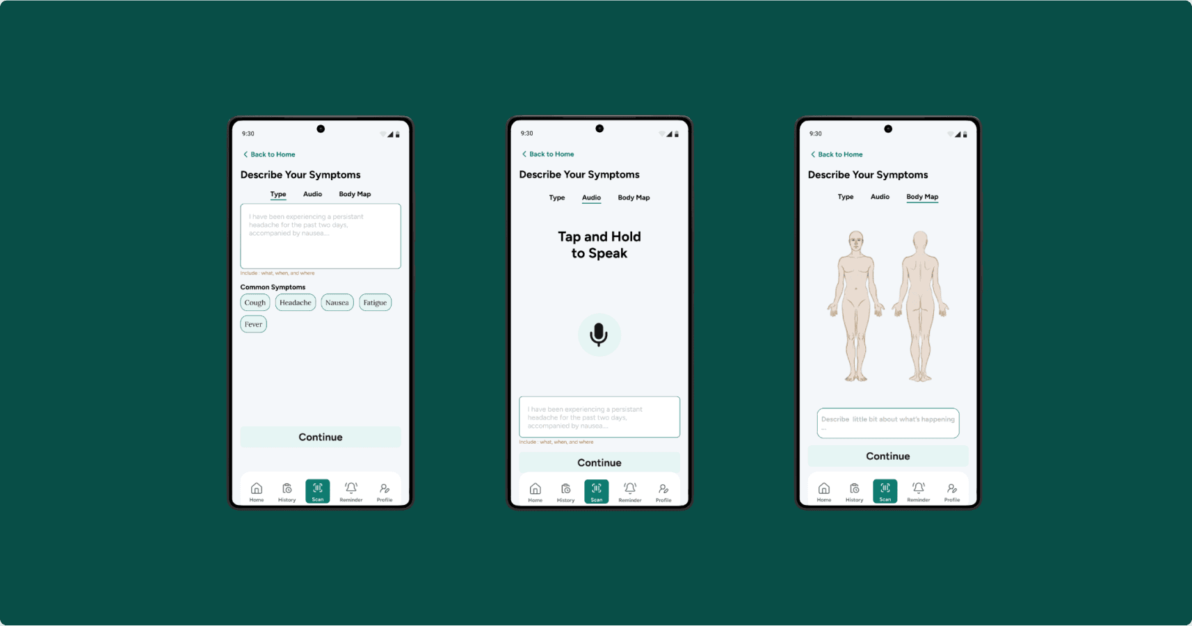
Means of sharing symptoms
Making flexible for users to share how they are feeling is really important on this flow so having type, talk and mapping means
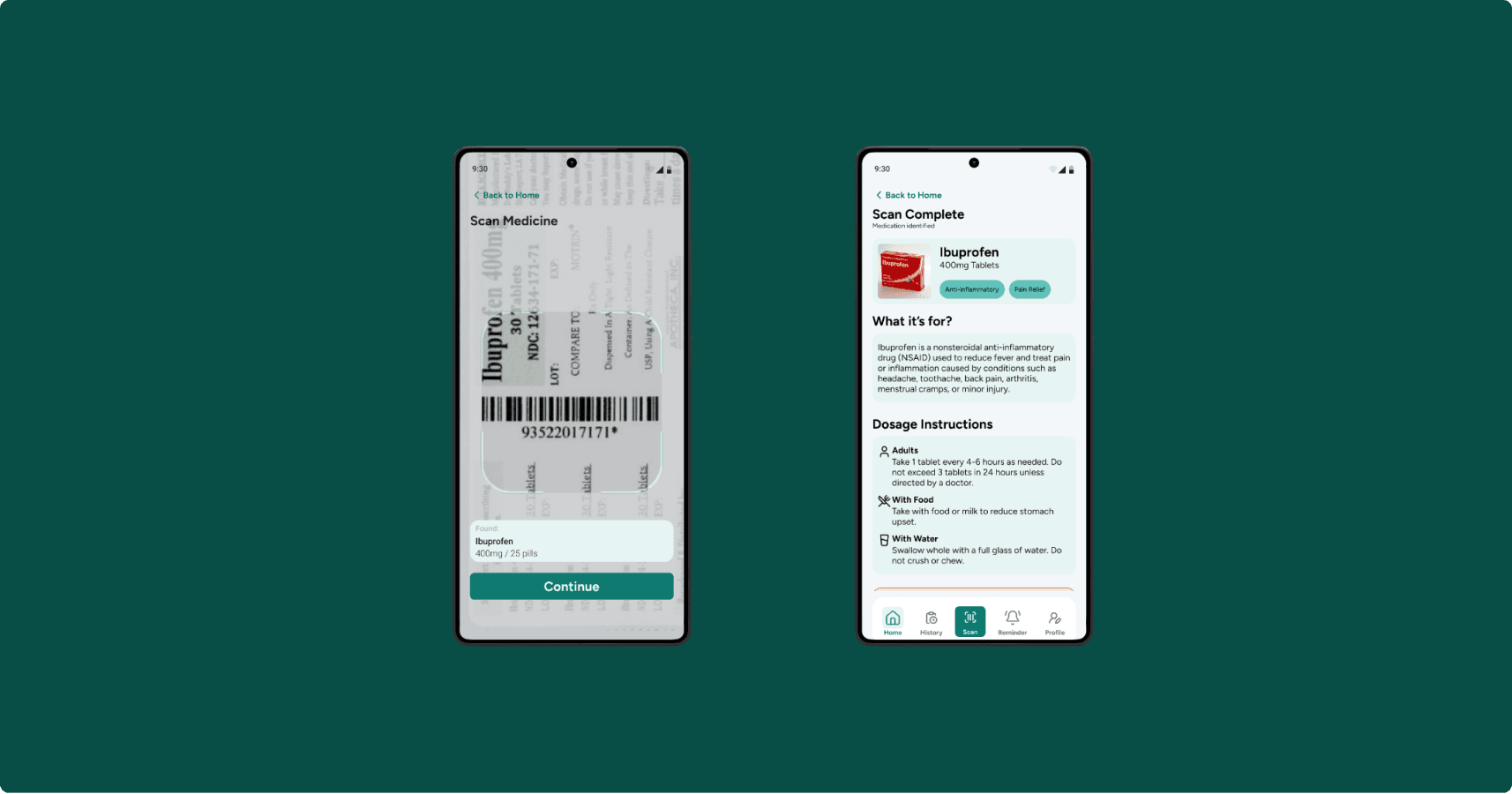
Know the label and medicine in simple way
Scan your medicine and get results of the medicine with with does it cure and used for, instructions, warning as well as side effects in simple words.
DESIGN DECISIONS / Process
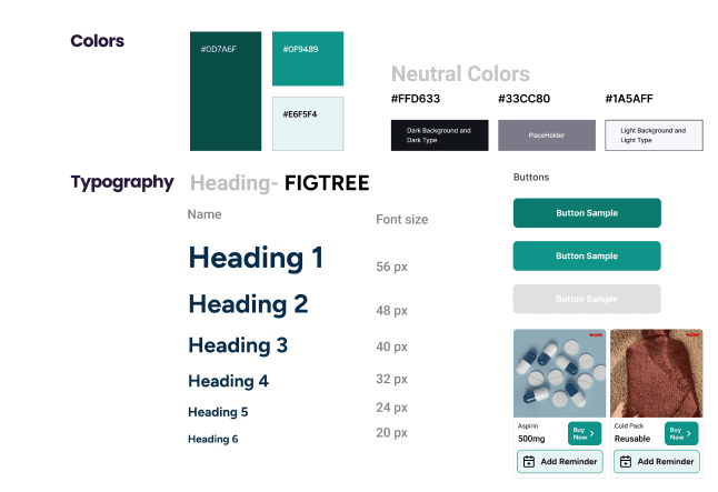
Design System from Scratch
I built a UI kit that included colors, typography, buttons, and reusable components. This ensured that my design across 15+ screens were cohesive! This was also how I learned how to create design systems.
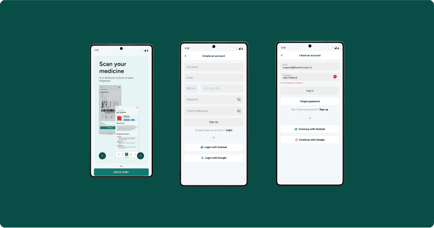
No lazy login
Medicinal app can be dangerous if used poorly. So not making a lazy login makes more safety for the users.
Android Focus
Our users are combined users so having a device which our users have high access is draws more targeted users to use it
AI Assistant
Not having a AI is disadvantage in current market, the AI is here for helping users to get more chat basis information and back and forth question and answering.

Medicinal App is highly researched based with all the information should be accurate. As well as building trust to the user and quick with accurate symptom checker flow was challenge which were in our way of the app.

NEXT
What Next?
Health Data 60% users don’t understand health data, so why not upload your health report and easily know what the report says. Scan Medicine Confusion What to scan in the medicine should be properly informative to the users so users won’t get confused on to scan medicine or its barcode Add the indicator in the symptom checking flow User might feel anxious while symptom checking and having no steps indicator
REFLECTION
Get Design Feedback Early
Communicate more than what I think is necessary. Holding design critiques would have been helpful to avoid redesigning last minute.
Don't fix everything all at once
In the future, I’ll focus on addressing one specific need at a time to create more intentional and effective design solutions..